Gravel or Brick: Choosing a Path Surface by Its Visual Role
Compare gravel and brick path surfaces beside your planting to see how texture, pattern, light, and edging shape the route's character and visual fit.
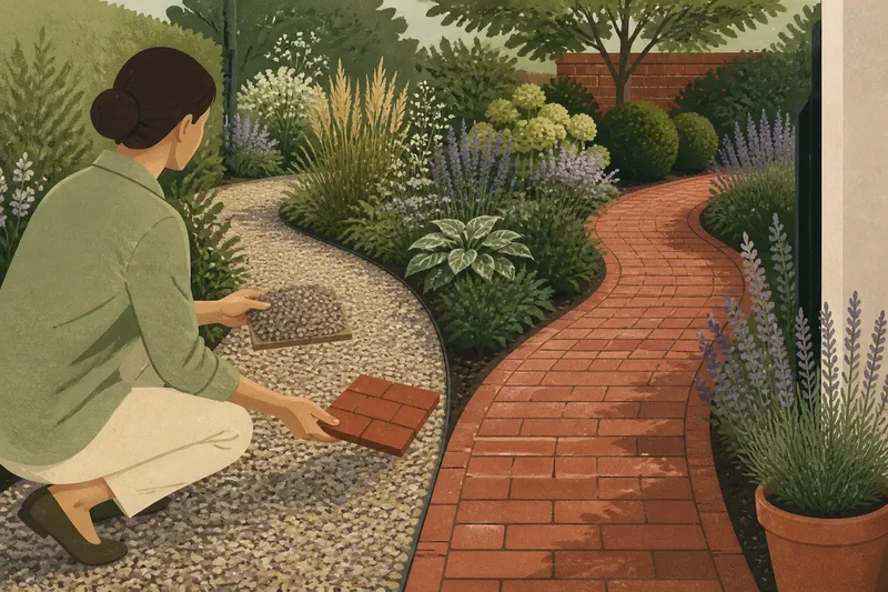
Choosing a gravel or brick path surface gets easier when you look at the route beside the plants, rather than judging a sample on a shop counter. Gravel creates a loose, granular field; brick sets out a repeating pattern with a firmer visual edge. Compare both in the actual garden view to see which surface gives the path the right role.
This is a choice about character, not a claim that one material suits every setting. Practical requirements matter too, but the surface also sets a visual pace: gravel tends to soften transitions, while brick makes the route more legible. Start by noticing what the planting seems to ask the path to do.
What should the path do beside the planting?
Stand where the path enters the garden and follow its line with your eye. Does it pass through loose, layered planting, run beside clipped forms, or divide beds with strong outlines? Your answer helps determine whether the surface should recede or add a distinct pattern.
Gravel is visually dispersed. Its small pieces create many fine marks, so it can sit comfortably beside mixed foliage and irregular bed edges. Brick is more composed: its units and joints make a visible grid, even when the colors are subdued. That pattern can organize planting with varied shapes, or compete with a bed that already has strong geometry.
Neither effect is automatically an advantage. Loose planting may make a narrow brick route feel formal; a clean, clipped border may make scattered gravel seem less deliberate. The useful question is not whether a material looks natural or traditional, but whether its visual activity balances the plants beside it.
How does gravel change the garden’s texture?
Gravel reads as a continuous field rather than a sequence of separate units. Its appearance depends on the stone’s color, angularity, and range of sizes. Rounded stones can seem softer in outline; angular chips create a crisper, broken surface. Pale gravel may stand out against dark planting, while a darker blend may sit quietly among deep foliage. The effect also depends on the garden’s light.
Without fixed joints, gravel can make a curved route feel unforced. Its texture lets the eye move between the path and nearby planting without stopping at a repeated line. That can suit self-seeding plants, grasses, and borders whose edges shift through the season. The trade-off is that an informal surface may look untidy if its boundary with the soil is unclear.
Say you have a narrow route beside soft-leaved perennials and are comparing a muted, angular gravel with a brick sample. You place both beside the bed and view them from the garden entrance: the gravel is expected to relate to the foliage without repeating its shapes, while the brick’s joints add a stronger visual line. If the gravel appears to blur into the soil, a visible edge is the likely fix; if the brick dominates the plants, a quieter bond or different surface may suit better. These are design expectations, not observations from an installed path.
A small handful of gravel gives limited information about a broad surface. Set a sample against actual leaves and soil, then view it in both open sun and shade if those conditions occur along the route. A shop photograph cannot show how the material will relate to your garden’s light.
What pattern does brick introduce?
Brick makes a route visible through repeated units, joints, and edges. A running bond gives a steady direction; basket weave produces a woven effect; herringbone adds a lively diagonal. Even a simple layout has enough repetition to make a path feel designed rather than incidental.
That order can help where planting has many textures. Brick offers the eye a stable surface among leaves that move, spread, or change shape. Its color can relate to a nearby wall or edging, though an exact match is not necessary. A restrained contrast lets both materials remain distinct.
Pattern matters as much as brick color. A strong diagonal can pull attention along the route, while a calmer bond can leave the border as the main event. A busy pattern may feel emphatic on a narrow path; a broad brick surface can read as a small terrace rather than a passage. Judge the whole visible run, not a single paver.
Brick also introduces a human-made quality that gravel does not. That can suit architectural planting or a formal boundary. Against loose, abundant planting, brick can provide a useful counterpoint, provided its edges and pattern do not make every nearby plant seem like an interruption.
How should you compare gravel and brick path surfaces?
Use the same route and viewpoints for each material. The aim is to compare visual role, so note where your eye travels, how the surface meets planting, and whether it seems too busy or too blank. For every observation, decide what you would change if the result does not fit.
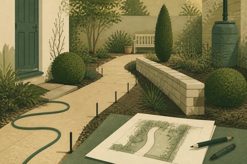
- Trace the route: Sketch its curves, narrow points, and meetings with beds. If the line already has strong turns, choose the sample that makes those turns legible without adding visual clutter; otherwise, compare a more pronounced pattern.
- Check morning light: Look at the path where morning light reaches it. If a sample stands out sharply from soil and foliage, try a closer color or place it in shade for comparison; if it disappears, consider a clearer contrast.
- Check brighter light: View both samples where the garden receives its strongest daylight. If gravel loses definition or brick joints become too emphatic, consider a different tone or pattern; if both remain balanced, keep them in contention.
- Use a doorway or window view: Look from a place where you often see the garden. If the route needs to read as a clear line, favor the sample with the more legible edge; if it should recede, favor the quieter surface and adjust the border if needed.
- Set samples beside the bed: Place a gravel sample and a brick sample against the actual leaves, edging, and nearby masonry. If one competes with a strong plant shape or wall color, set it aside or try a less contrasting finish; if both relate well, compare their patterns next.
- Assess visual activity: Look at how much pattern the planting already supplies. If the border has strong shapes and contrasts, choose the surface that gives it more visual space; if the planting is restrained, consider whether a more defined pattern would add useful structure.
- State the path’s role: Write a short description such as “a quiet textured route” or “a patterned line that organizes the border.” If one sample supports that role in the garden views, choose it; if neither does, change the sample, edge, or pattern before deciding.
Think of the path as a frame around a picture: it can clarify the scene, but an ornate frame can compete with it. Include the route’s edges in the comparison, not only its center. Brick may need a clear transition to keep its pattern legible; gravel may need an edge that contains its loose texture. The edging is part of the visual decision, not a minor afterthought.
Which details change the visual result most?
Color: Compare the surface with the leaves, bark, soil, and walls visible from the main viewing points. Warm brick may relate to nearby masonry, while cool or neutral gravel may separate the path from it. If either surface merges with its surroundings, try a more distinct tone; if it stands apart too sharply, compare a quieter one.
Scale: Fine gravel tends to read as a close texture; larger stones are more conspicuous. Brick units and joint spacing create a rhythm that becomes more visible across a broad area. If the path occupies a small part of the view, favor a restrained texture or bond; if it forms a strong visual line, check that its scale does not overwhelm the planting.
Edge: A crisp edge makes the boundary between path and bed easy to read. A soft edge can suit a loose garden, but it should look intentional. If gravel seems to spill into the plants, add or reconsider an edge; if the path looks too sharply separated, compare a softer transition.
Nearby materials: Repeating the exact color of a wall or edging may flatten the scene. A related but distinct tone can make the path feel connected without making every surface merge into one block. If the path disappears against nearby masonry, shift the tone; if it feels unrelated, compare a closer color or texture.
For practical suitability, check the product label, manufacturer instructions, and applicable local requirements, especially where access or drainage matters. If those requirements rule out a preferred option, ask a qualified contractor or local authority about suitable alternatives before settling on appearance.
What do gardeners ask about gravel and brick paths?
Does gravel make a garden path look more informal?
Gravel often reads as less rigid because it has no repeating joints, but a crisp edge and consistent stone can make it look carefully composed. The planting and route shape affect that impression too.
Does brick always make a path look formal?
No. Brick introduces visible order, but a simple bond, softened color, and relaxed planting can keep the result approachable. A strong pattern or sharp border will make the same brick feel more formal.
Can gravel and brick appear in the same garden?
Yes, if each has a distinct role, such as brick marking a main route and gravel forming a quieter link. Keep the transition clear so the change reads as intentional rather than unfinished.
Which surface suits a border with many different plants?
Gravel can echo a border’s varied texture without adding a strong repeating pattern. Brick can also work if the planting benefits from a steadier visual line; compare samples in the actual setting before deciding.
How can you make the final choice?
Return to your short description of the path’s role. If you want a textured surface that recedes among varied planting, gravel may be the more coherent visual choice. If the route needs a visible pattern to steady a busy border or relate to masonry, brick may serve better.
Keep the gravel or brick path surface decision grounded in the view you actually have, not an idealized garden photograph. A handful of gravel and a single brick are clues, not verdicts; compare them beside the planting and along the route’s full shape. Choose the material whose texture, pattern, and edge let the garden read as one scene, with the path doing its job and no more.